Introduction
This vignette walks users through the mechanics of the functions that produce all of the Analysis workflow output within the gsm package. gsm leverages Key Risk Indicators (KRIs) and thresholds to conduct study-level and site-level Risk Based Monitoring for clinical trials.
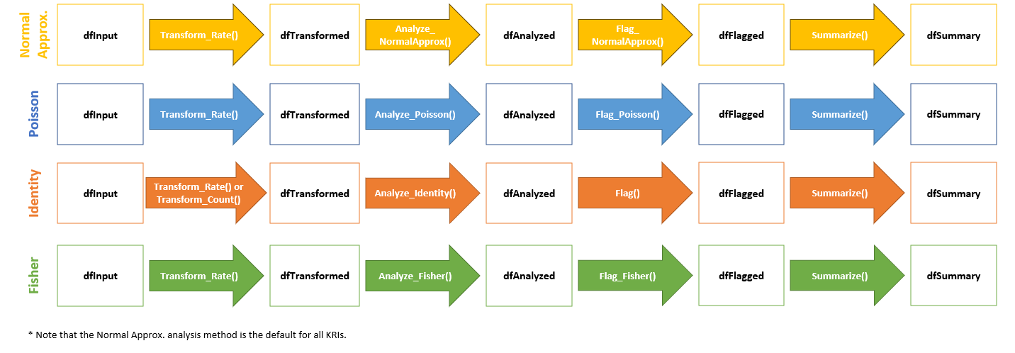
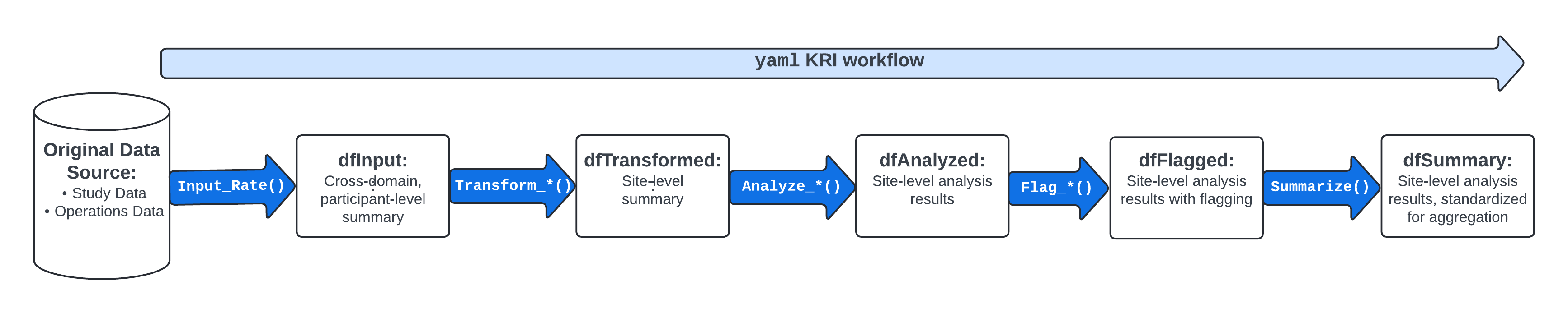
These functions provide data frames, visualizations, and metadata to be used in reporting and error checking at clinical sites. The image below illustrates the supporting functions that feed into the yaml workflow that is specified in each analysis workflow.
All of these functions will run automatically and sequentially when a
user calls upon the RunWorkflow() function with a specified
yaml file for KRI metrics found in the workflow/2_metrics
directory of the gsm package.
Each of these individual functions can also be run independently outside of a specified yaml workflow.
For the purposes of this documentation, we will evaluate the input(s) and output(s) of each individual function for a specific KRI to show the stepwise progression of how a yaml workflow is set up to handle and process data.
Case Study - Step-by-Step Adverse Event KRI
We will use sample clinical data from the {clindata}
package to run the Adverse Events (AE) Assessment, i.e.,
AE_Assess(), using the normal approximation method.
Additional statistical methods and supporting functions are explored in Appendix 1.
1. Create dfInput
Start by creating dfInput using sample rawplus data from
clindata. Note that Input_Rate() requires
three specific datasets from clindata, which include a
subject-level demographics/exposure dataset (dfSubjects)
and a domain-level dataset (dfNumerator) that records every
adverse event per subject.
Since Input_Rate() is a generalized function, it is also
required that you specify the relevant column names for the Subject
(strSubjectCol), Group (strGroupCol) and
optionally the Denominator (strDenominatorCol) and
Numerator (strNumeratorCol) when it is not simply
“Denominator” or “Numerator”, respectively.
Finally, the method for calculating the Numerator and Denominator is
specified in strNumeratorMethod and
strDenominatorMethod as either “Count” or “Sum”. If the
method is “Count”, the function simply counts the number of rows in the
provided data frame. If the numerator method is “Sum”, the function
takes the sum of the values in the specified column (strNumeratorCol or
strDenominatorCol).
dfInput <- Input_Rate(
              dfSubjects = clindata::rawplus_dm,
              dfNumerator = clindata::rawplus_ae,
              dfDenominator = clindata::rawplus_dm,
              strSubjectCol = "subjid",
              strGroupCol = "siteid",
              strNumeratorMethod = "Count",
              strDenominatorMethod = "Sum",
              strDenominatorCol = "timeonstudy"
)
The data frame dfInput for an AE assessment will be
created by running Input_Rate() and will have one record
per subject, with the following columns:
-
SubjectID: Subject Identifier -
GroupID: Group Identifier -
GroupLevel: Type of Group specified inGroupID(Country, Site) -
Numerator: Total Time on Treatment (measured in days; per subject) -
Denominator: Total Number of Event(s) of Interest (in this example, the number of AEs reported; per subject) -
Metric: Rate of Event Incidence (calculated asExposure/Count; per subject)
2. Create dfTransformed
The data frame dfTransformed is derived from
dfInput using a Transform() function. In our
example, the analysis pipeline pulls in Transform_Rate()
since the default metric for AEs is the number of AEs reported over the
course of treatment per site, i.e., a rate.
dfTransformed <- Transform_Rate(dfInput)The resulting dfTransformed data frame will contain
site-level transformed data, including KRI calculation. Using our
example AE data, dfTransformed contains the following
columns:
-
GroupID: Group Identifier (default is Site ID) -
GroupLevel: Type of Group specified inGroupID(Country, Site) -
Numerator: Cumulative Number of Event(s) of Interest (in this example, number of AEs reported across subjects) -
Denominator: Cumulative Time on Treatment (in days, across subjects) -
Metric: Rate of Event(s) of Interest (in this example, number of AEs reported over the course of treatment in days)
3. Create dfAnalyzed
The data frame dfAnalyzed is derived from
dfTransformed using an Analyze() function,
which incorporates a specific statistical model. The resulting
dfAnalyzed data frame will contain site-level analysis
results data. The normal approximation method is the default statistical
model for AE data, so the analysis pipeline automatically runs
Analyze_NormalApprox().
dfAnalyzed <- Analyze_NormalApprox(dfTransformed)
#> `OverallMetric`, `Factor`, and `Score` columns created from normal
#> approximation.
Using our example AE data, dfAnalyzed contains the
following columns:
-
GroupID: Group Identifier (default is Site ID) -
GroupLevel: Type of Group specified inGroupID(Country, Site) -
Numerator: Cumulative Number of Event(s) of Interest (in this example, number of AEs reported across subjects); Carried fromdfTransformed. -
Denominator: Cumulative Time on Treatment (in days, across subjects); Carried fromdfTransformed. -
Metric: Rate of Event(s) of Interest (in this example, number of AEs reported over the course of treatment in days); Carried fromdfTransformed. -
OverallMetric: Aggregate metric for the group that is being assessed. ( sum(Numerator) / sum(Denominator) ). -
Factor: Calculated over-dispersion adjustment factor (mean of the z-score sum of squares calculated in the analysis functions). -
Score: Calculated Residual (per site).
4. Create dfFlagged
The data frame dfFlagged is derived from
dfAnalyzed using a Flag() function. The
resulting dfFlagged data frame will contain site-level
analysis results data with flagging incorporated based on a
pre-specified statistical threshold to highlight possible outliers.
dfFlagged <- Flag_NormalApprox(dfAnalyzed, vThreshold = c(-3, -2, 2, 3))
#> ℹ Sorted dfFlagged using custom Flag order: 2.Sorted dfFlagged using custom Flag order: -2.Sorted dfFlagged using custom Flag order: 1.Sorted dfFlagged using custom Flag order: -1.Sorted dfFlagged using custom Flag order: 0.
The default flagging function for the normal approximation method is
Flag_NormalApprox() and the default threshold is (-3, -2,
2, 3). Using our example AE data, dfFlagged contains the
following columns:
-
GroupID: Group Identifier (default is Site ID) -
GroupLevel: Type of Group specified inGroupID(Country, Site) -
Numerator: Cumulative Number of Event(s) of Interest (in this example, number of AEs reported across subjects); Carried fromdfAnalyzed -
Denominator: Cumulative Time on Treatment (in days, across subjects); Carried fromdfAnalyzed -
Metric: Rate of Event(s) of Interest (in this example, number of AEs reported over the course of treatment in days); Carried fromdfAnalyzed -
OverallMetric: Aggregate metric for the group that is being assessed. ( sum(Numerator) / sum(Denominator) ). -
Factor: Calculated over-dispersion adjustment factor (mean of the z-score sum of squares calculated in the analysis functions); Carried fromdfAnalyzed. -
Score: Calculated Residual (per site); Carried fromdfAnalyzed -
Flag: Flag Indicating Possible Statistical Outliers; Valid values for this variable include -2, -1, 0, 1, and 2, which determine the “extremeness” of the outlier. -2 and 2 represent more extreme outliers, -1 and 1 represent less extreme outliers, and 0 represents a non-outlier.
5. Create dfSummary
The data frame dfSummary is derived from
dfFlagged using the Summarize() function. The
resulting dfSummary data frame will contain the most
relevant columns from dfFlagged with data sorted in a
meaningful way to provide a concise overview of the assessment. Flagged
sites will sort earlier than non-flagged sites, with the more “extreme”
outliers displayed first. The columns in dfSummary
include:
-
GroupID: Group Identifier (default is Site ID) -
GroupLevel: Type of Group specified inGroupID(Country, Site) -
Numerator: Cumulative Number of Event(s) of Interest (in this example, number of AEs reported across subjects); Carried fromdfAnalyzed -
Denominator: Cumulative Time on Treatment (in days, across subjects); Carried fromdfAnalyzed -
Metric: Rate of Event(s) of Interest (in this example, number of AEs reported over the course of treatment in days) -
Score: Calculated Residual (per site) -
Flag: Flag Indicating Possible Statistical Outliers; Valid values for this variable include -2, -1, 0, 1, and 2, which determine the “extremeness” of the outlier. -2 and 2 represent more extreme outliers, -1 and 1 represent less extreme outliers, and 0 represents a non-outlier.
dfSummary <- Summarize(dfFlagged)6. Data Visualization
For a single Normal Approximation AE assessment, a scatter plot of
Total Exposure (in days, on log scale) vs Total Number of Event(s) of
Interest (on linear scale) is created. Each data point represents one
site with outliers displayed in yellow or red, depending on the
“extremeness” of the KRI value. The Visualize_Scatter()
function takes inputs of dfBounds– which defines bounds
based on the statistical model, dfTransformed and
thresholds using Analyze_NormalApprox_PredictBounds()– and
dfFlagged to plot the data. Using our example AE data, we
see the following scatter plot:
dfBounds <- Analyze_NormalApprox_PredictBounds(dfTransformed, vThreshold = c(-3, -2, 2, 3))
#> nStep was not provided. Setting default step to 203.584.

chart <- Visualize_Scatter(dfFlagged, dfBounds)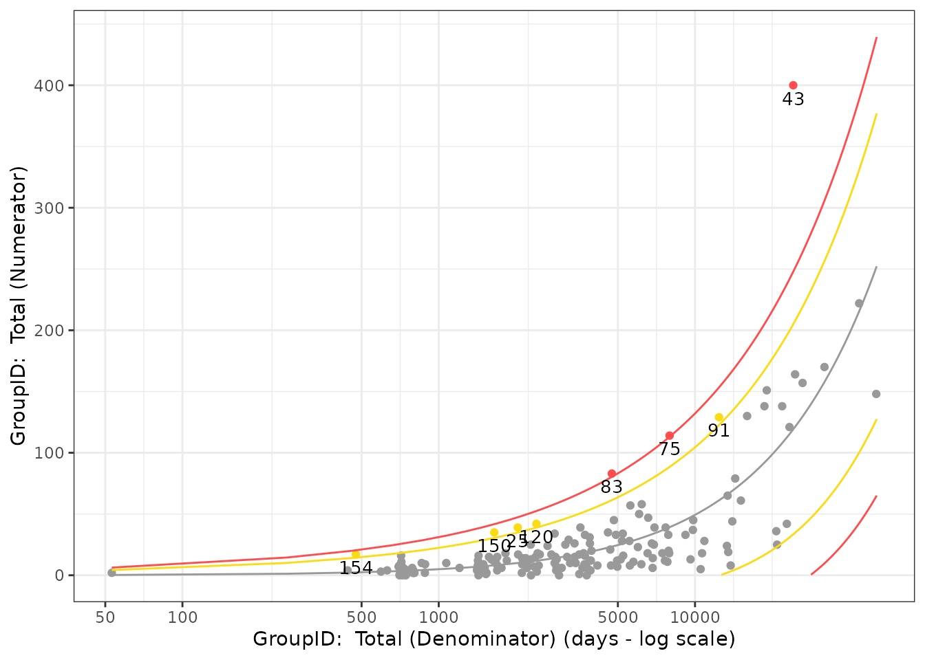
A full explanation of all Data Visualizations in the
gsm package is outlined in the
vignette("DataReporting").
Recap - Normal Approximation Adverse Event KRI
-
dfInputused as original input usingInput_Rate() -
dfTransformedcreated fromdfInputusingTransform_Rate() -
dfAnalyzedcreated fromdfTransformedusingAnalyze_NormalApprox() -
dfFlaggedcreated fromdfAnalyzedusingFlag_NormalApprox() -
dfSummarycreated fromdfFlaggedusingSummarize() - Scatter plot created from
dfTransformedanddfBoundsusingVisualize_Scatter()
Appendix 1 - Supporting Functions
The following sections include various examples of supporting functions and statistical models that can be employed in the Analysis workflow. Please note that this is not an exhaustive list, but includes some of the most commonly called upon functions.
Mapping Functions
-
RunQuery(): Run a SQL query to create new data.frames with filtering and column name specifications. -
Input_Rate(): Calculate a subject level rate from raw numerator and denominator data
Transform Functions
-
Transform_Rate(): Calculates cumulative rate of Event(s) of Interest per site -
Transform_Count(): Calculates cumulative number of Event(s) of Interest per site
Analyze Functions
-
Analyze_NormalApprox(): Uses funnel plot method with normal approximation to create analysis results for percentage/rate. -
Analyze_Fisher(): Uses Fisher’s Exact Test to determine if there are non-random associations between a site and a given KRI -
Analyze_Identity(): Used in the data pipeline betweenTransform()andFlag()functions to rename KRI and Score columns -
Analyze_Poisson(): Uses a Poisson model to describe the distribution of events in the overall site population, i.e., determine how many times an event is likely to occur at a site over a specified treatment period
Flag Functions
-
Flag_NormalApprox(): Default flagging function whenAnalyze_NormalApprox()is used for an assessment. -
Flag_Fisher(): Default flagging function whenAnalyze_Fisher()is used for an assessment -
Flag_Poisson(): Default flagging function whenAnalyze_Poisson()is used for an assessment -
Flag(): Default flagging function whenAnalyze_Identity()is used for an assessment
Visualization Functions
-
Visualize_Scatter(): Creates scatter plot of Total Exposure (in days, on log scale) vs Total Number of Event(s) of Interest (on linear scale). Each data point represents one site. Outliers are plotted in red with the site label attached. This plot is only created when statistical method is not defined asidentity. -
Visualize_Score(): Provides a standard visualization for Score or KRI. -
Visualize_Metric(): Creates all available charts for a metric using the data provided.
What Statistical Models Are Available For Each Assessment?
- By default, all yaml workflow assessments specified in the
inst/workflows/directory use the normal approximation method. - Optionally, other statistical methods include: Poisson, Fisher’s Exact, and Identity.