Description
Make it easier for users to explore the raw domain data presented on the Domain Details tab.
Features & Bug Fixes
Explore the screenshot evidence presented here to determine if you agree that the app does what is described. Click images for larger versions. If you agree that the app does what is described, go to the linked GitHub issue for that feature or bug fix, and comment with your approval. If you do not agree, go to the linked GitHub issue for that feature or bug fix, and comment with what you believe is incorrect.
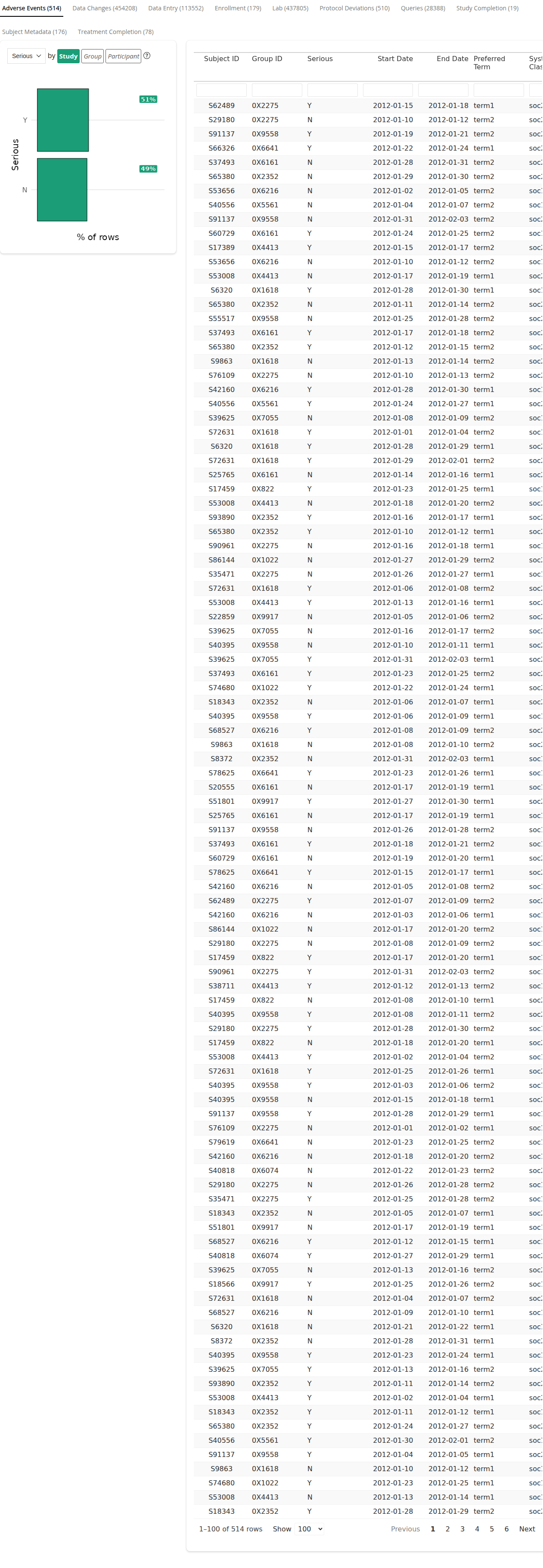
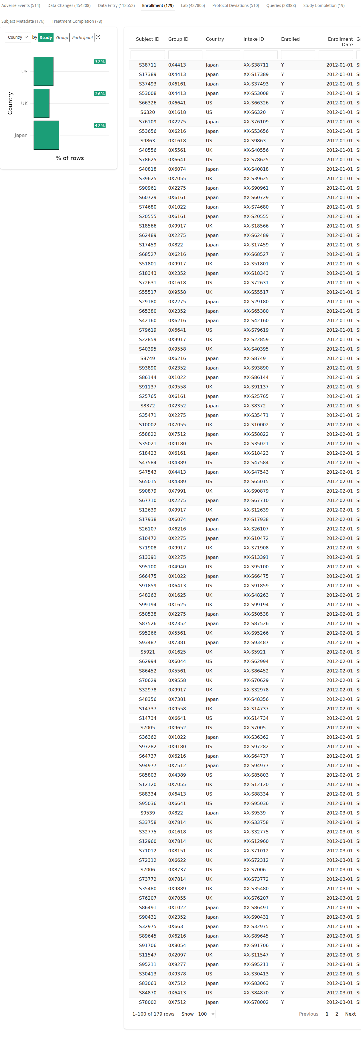
543: Feature: The user can view counts of records for each available data domain.
Domain row counts appear in parentheses after the title of each domain in the Domain Details tab’s tabbed view of tables.

The domain row counts update based on the selected “Group” and “Participant” filters.


The Domain Summary panel no longer appears on the Domain Details tab.

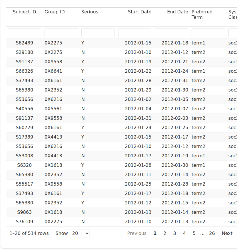
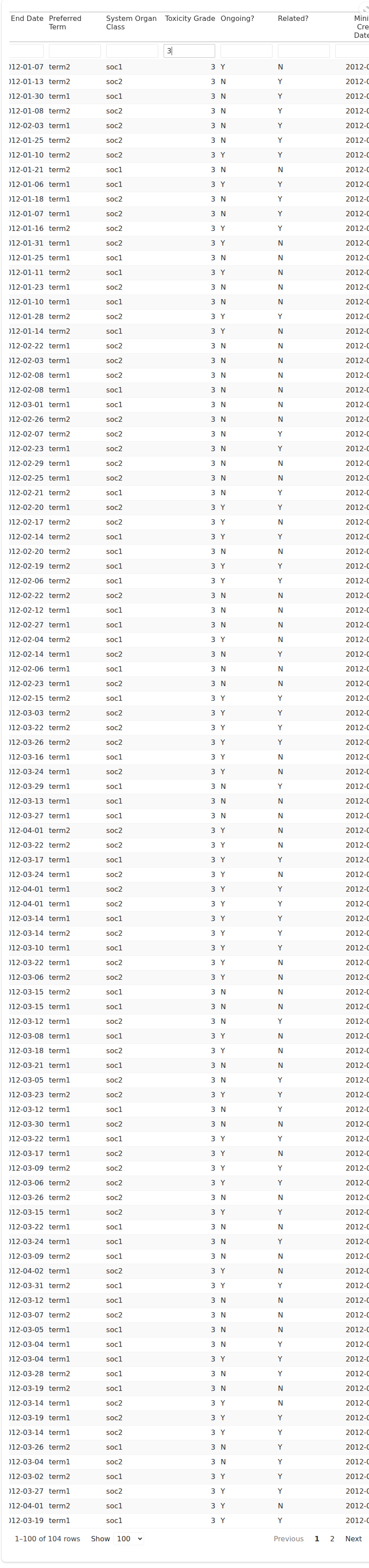
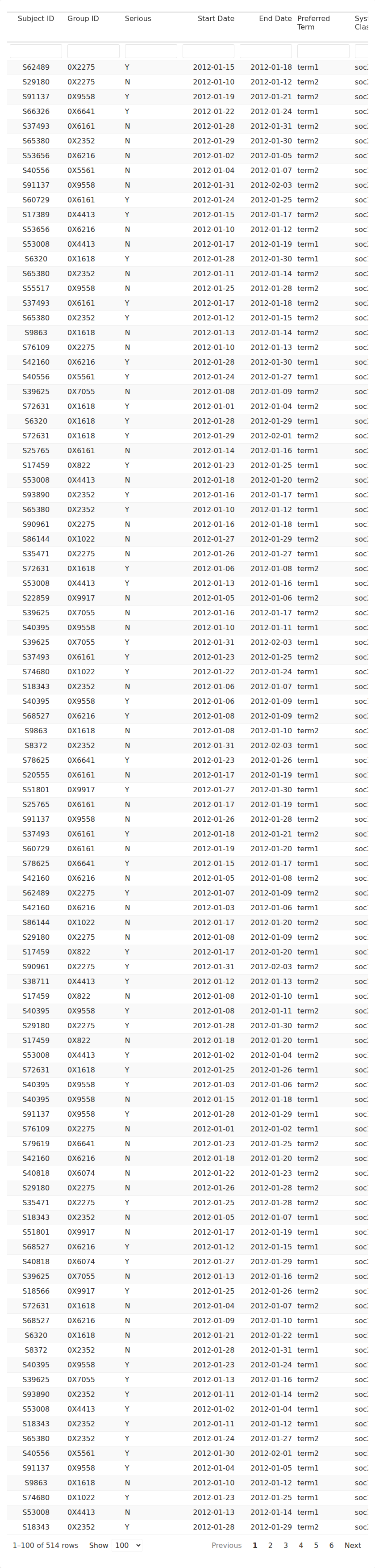
385: Feature: The user can filter domain data.
Each column in the domain data tables has a field where users can type.
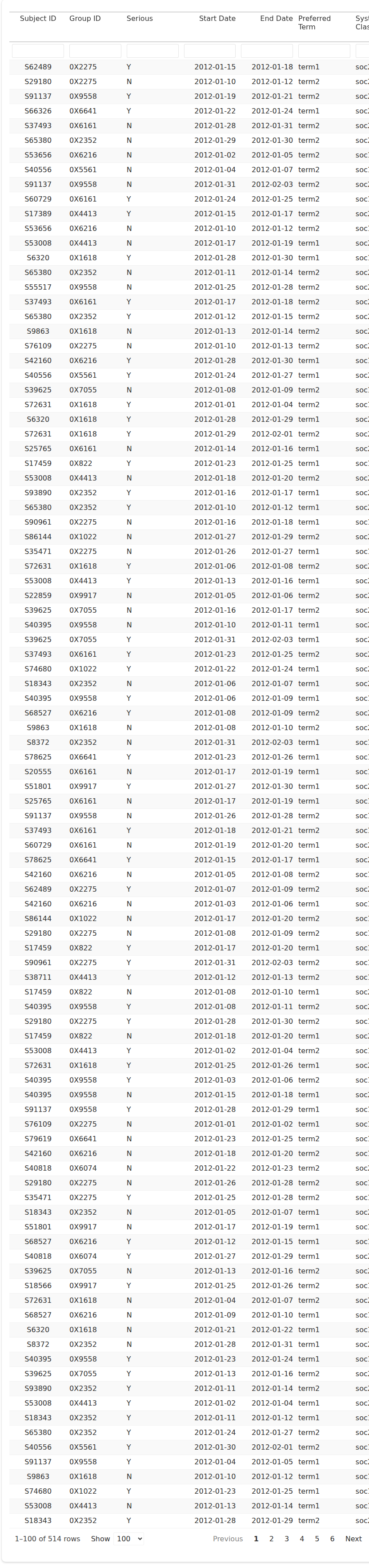
Data in the table is subset to include whatever is typed.
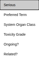
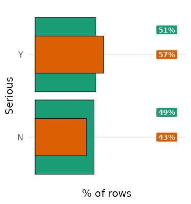
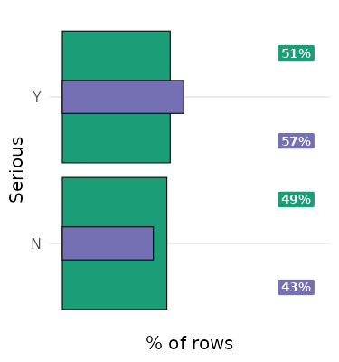
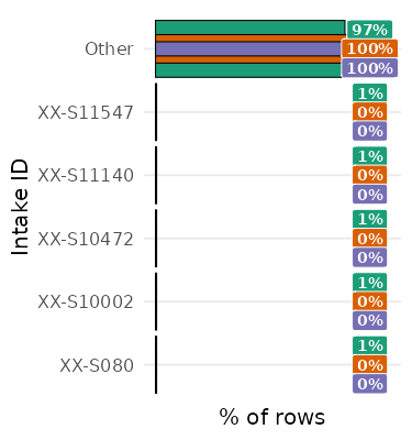
496: Feature: The user can visualize domain categorical variable counts by value.
The ‘Domain Details’ tab includes a ‘Prevalence’ card for each domain.
The user can select a column to display in the ‘Prevalence’ card (out of all categorical-like fields other than group level, group id, and subject id), defaulting to the first valid column.
The ‘Prevalence’ card displays a color-coded key for Study.

The ‘Prevalence’ card displays a bar plot of ‘% of rows’ vs the values of the selected column, colored to indicate that it is at the Study level.
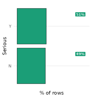
The ‘Prevalence’ card displays a label with the numeric % of each value, colored to indicate that it is at the Study level.

When a group is selected, the ‘Prevalence’ card displays a color-coded key for that group, as ‘{Group Level} {GroupID}’.

When a group is selected, the ‘Prevalence’ card also displays a bar filtered to just the selected group, colored to indicate that it is at the Group level.
When a group is selected, the ‘Prevalence’ card also displays a label with the numeric % of each value filtered to just the selected group, colored to indicate that it is at the Group level.

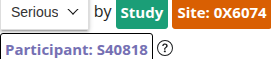
When a participant is selected, the ‘Prevalence’ card displays a color-coded key for that participant, as ‘Participant {SubjectID}’.
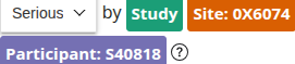
When a participant is selected, the ‘Prevalence’ card also displays a bar filtered to just the selected participant, colored to indicate that it is at the Participant level.
When a participant is selected, the ‘Prevalence’ card also displays a label with the numeric % of each value filtered to just the selected participant, colored to indicate that it is at the Participant level.

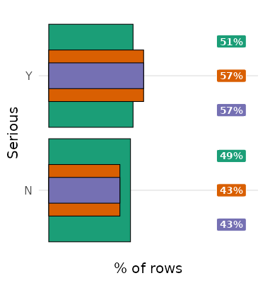
The user can turn the Study bar and label on and off using the color-coded Study key.
When a group is selected, the user can turn the Group bar and label on and off using the color-coded Group key.
When a participant is selected, the user can turn the Participant bar and label on and off using the color-coded Participant key.
When there are more than 6 values, the plot shows the top 5 values plus ‘Other’.
555: Feature: Increase number of rows shown in domain details
Domain data tables show up to 100 rows by default.

Users can change the number of displayed rows to 20 or 1000.